2D:
In this project we were tasked with creating our own unique letterforms. We were asked to collect interesting items to make these alphabets out of, before creating them, photographing them in black and white, naming them, and displaying them as a photoshop document.
I decided to name each of my alphabets after different songs relating to each letterform. Personally, I think a lot of my letterforms look better in colour, and wish I had spent more time thinking of ways to experiment with the fact they were shot in this way. I think my favourite alphabet is my Scissor Sisters one made out of the contents of a sewing kit. Overall I wish I had gathered more unique items rather than just collections, I think it would have been nice to see them displayed in different ways other than just laid out into the basic shape of letters.
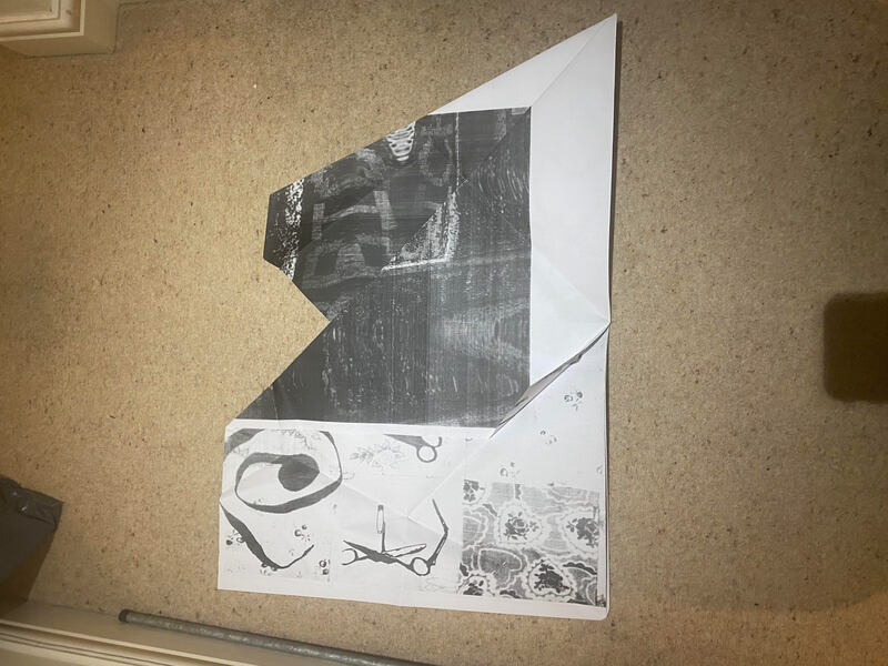
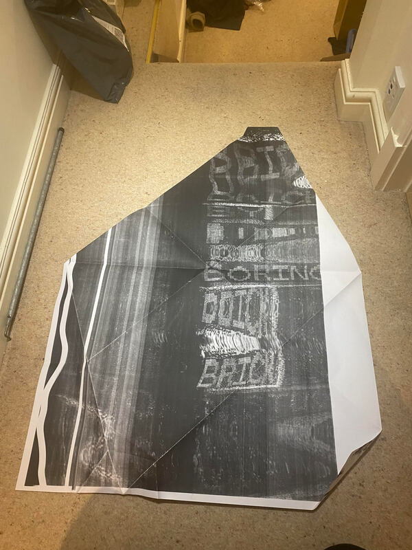
After this, I was tasked with experimenting using the photocopiers in the studio, creating patterns and distorting my work. Following this, we experimented by super sizing our pieces to A1 and A0 size, before folding them into unique shapes.
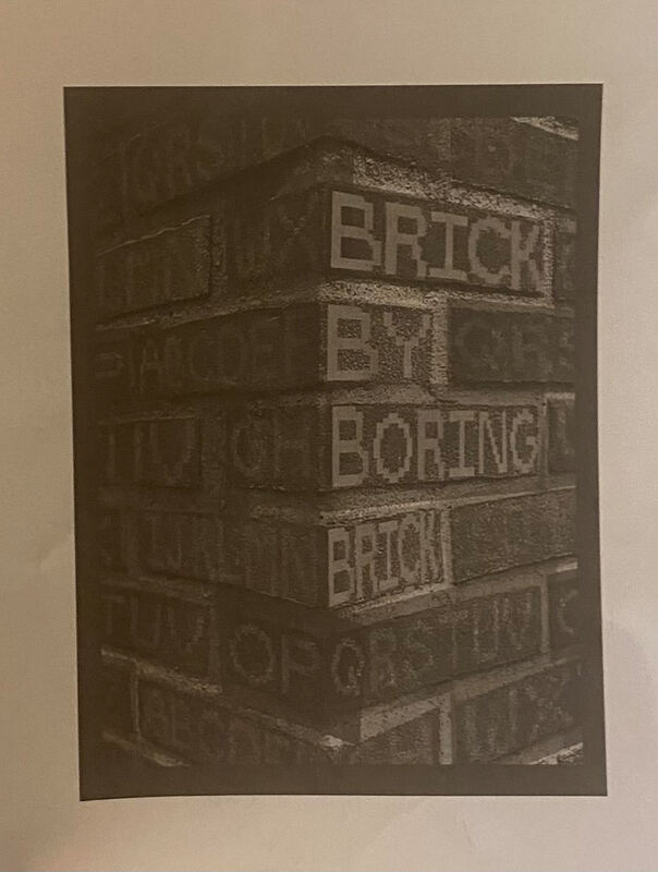
We were asked to create 2 posters using our letter forms in creative ways. I chose to use my Brick By Boring Brick letterform, and my Scissor Sisters one. For the Scissor alphabet, I wanted to put it on a quilted background, surrounded by various pieces of sewing equipment because that is what the letterforms were created using. For the Lego brick letterform, I decided to experiment by distorting the text and having the letters line up with the bricks in a wall. I played about with lighting and textures within this piece, trying to get a balance in which the words could be clearly seen, without being too obvious.
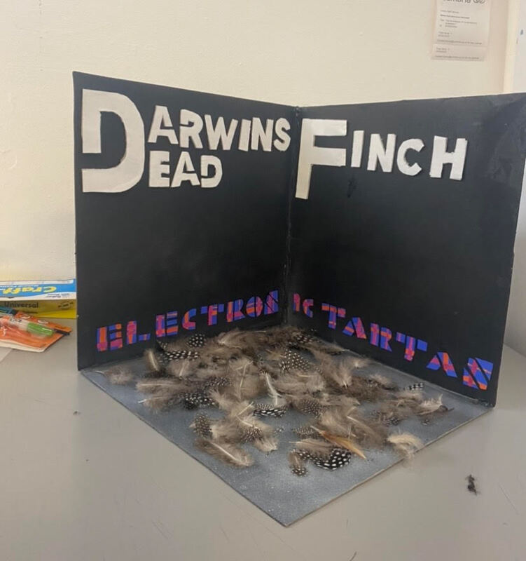
In this project, we were asked to create a 3d box that would then be photographed and used as the album cover for a made up band. The band names, album title, and genre were generated using an excel spreadsheet. My generated items were:
Genre: Boyband
Band Name: Darwin's Dead Finch
Album Title: Electronic Tartan
Straight away I began by trying to figure out how these 3 topics can compliment each other, or any overlapping areas that I could use. To me, Darwin's Dead Finch and Electronic Tartan give me punk and alternative vibes, something I thought would be hard to pair with the boyband genre, or possibly could be a very interesting contrast.
I decided to move away from current 2000s-esque boybands like One Direction, and focussed more on 70's and 80's era such as; Bay City Rollers, The Osmand Brothers, A-ha, Duran Duran, Wet Wet Wet, etc. I was interested in making a mock stage set up, leaning into the joke of how all boybands perform a ballad sitting down on stools on stage, possibly with a Top of the Pops themed background. Ultimately I decided against this as I wanted to explore more of the other aspects of the brief, not just the genre.
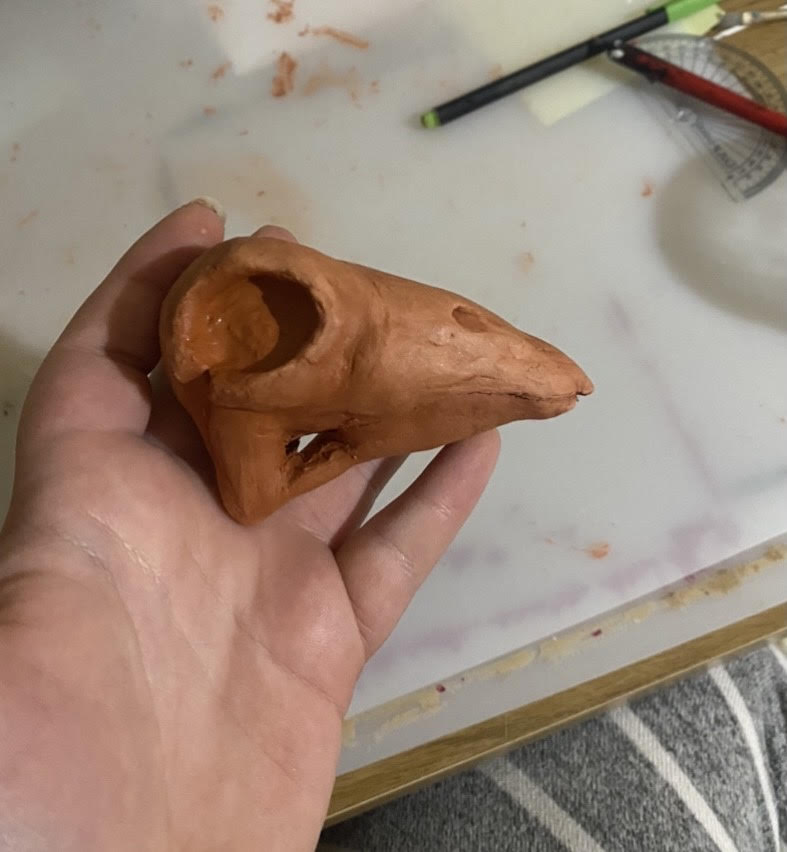
In doing this, I leaned more into the band name, and liked the idea of combining birds and electricity, possibly an electrocuted bird sat on telephone wires (not exactly accurate, but an interesting visual). I then began thinking of how I could possibly create this and decided upon using clay and wire to create a bird skeleton. The final box design was the bird centred in the middle, sat on a bed of feathers. I considered making a power outage switch box in the background, but due to the size of the bird I decided the box would be too cramped.
I created the letters myself out of card and paper, using a retro styled font, tying back into the electric and 80s aspects. While I am happy with how the bird skeleton looks, I wish I had explored a few more ideas before just jumping in. I definitely think there are better executions for this brief, and had I spent longer developing my ideas I think I would be much happier with the final product. I honestly think I got carried away at the idea of creating the skeleton, as I enjoy working with clay and creating structures, and knew the final bird skeleton would look impressive. However, just because it looks "cool" and excites me, doesn't make it a good idea in term of design for this project. Due to the bird being centre of the box, and the background being painted solid black, the box loses depth, and the 3d effect is wasted.
I learned a lot from this project, namely that I really need to think about the purpose of my work before jumping right into creating something, and jus because I am excited about an idea, doesn't necessarily mean it is suitable for this current project. If I were to redo this project, or for any future projects, I am going to ensure that if I am becoming transfixed on one particular idea and really want to work further on it, despite it not being the best solution, I will work on that in my spare time, outside of the project. This means I am still able to explore things that interest and excite me, whilst still being able to complete the actual project work to a good standard.
4D:
For some reason I cannot move my Animations section into this section of my website, over summer I am going to try and fix this issue. I wanted to ensure my work was able to be viewed and accessed without accidentally deleting the entire page, so for now please either click the button below, or there should be a link next to my Semester 3 tab in the Year 1 drop down bar.


