Project 1: The Comic
|
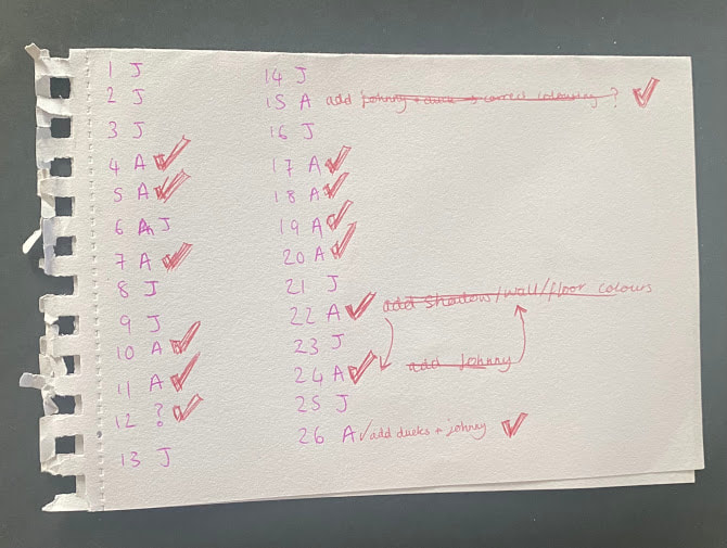
For the first project I was in a group of 3 and asked to create a comic book for the nursery rhyme Rain Rain Go Away. After reading through the nursery rhyme, I began by brainstorming trying to think of a cohesive storyline, or a general idea for the panels. Initially we massively overcomplicated our story, planning to have the terrible weather in the rhyme replicate a women's state of mind. After planning out an entire comic, filled with dark rainy streets, psychedelic acid rain, and writing all over the walls, we decided choosing a simpler story would be more appropriate.
|
|
|
Instead we decided to write the comic based on the little boy Johnny from the nursery rhyme, where he is stuck inside all day due to extreme rainfall. We knew that working together to make one cohesive comic would be hard due to differing art styles, so we decided to look for a simple illustration style we both liked and felt we could easily replicate. As well as this, we figured out which panels each person would draw, grouping them according to what they contain. This meant all of the windows, houses, and boy are similar and not disjointed. Another thing we discussed was colour palettes, we knew to keep the comic flowing smoothly we should use similar shades for scenes within the house, such as clothing and decorations. I used the app Coolors to generate some palettes I liked and wanted to use in the comic, and then shared with the group to use.
|
|
|
|
|
|
|
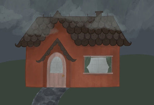
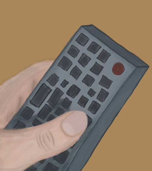
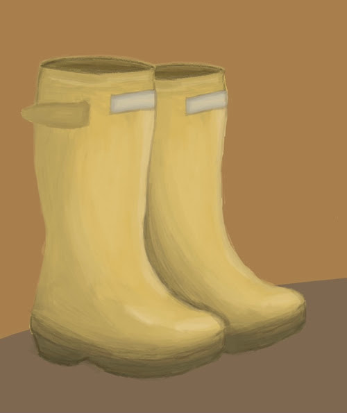
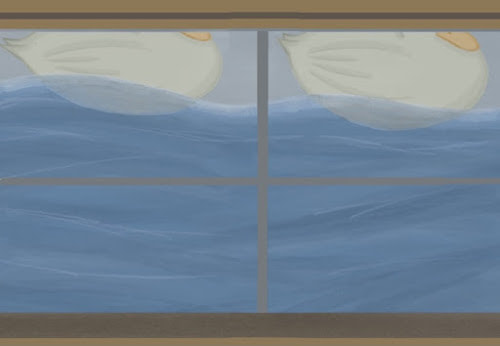
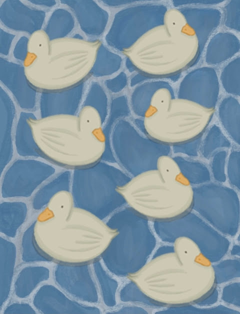
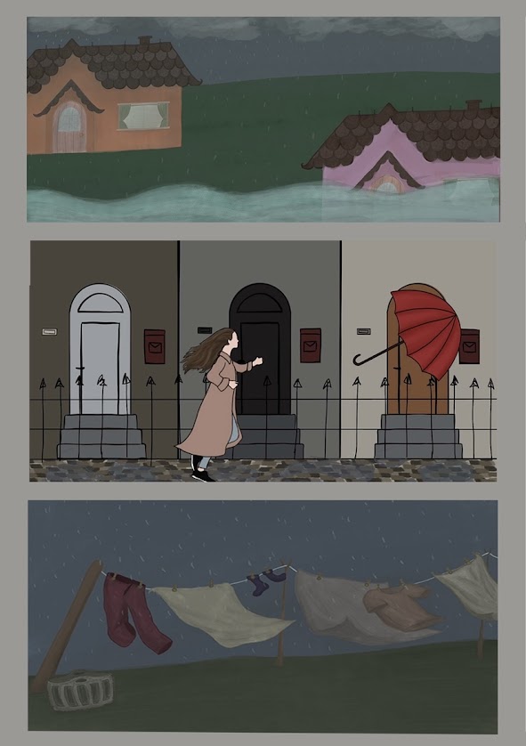
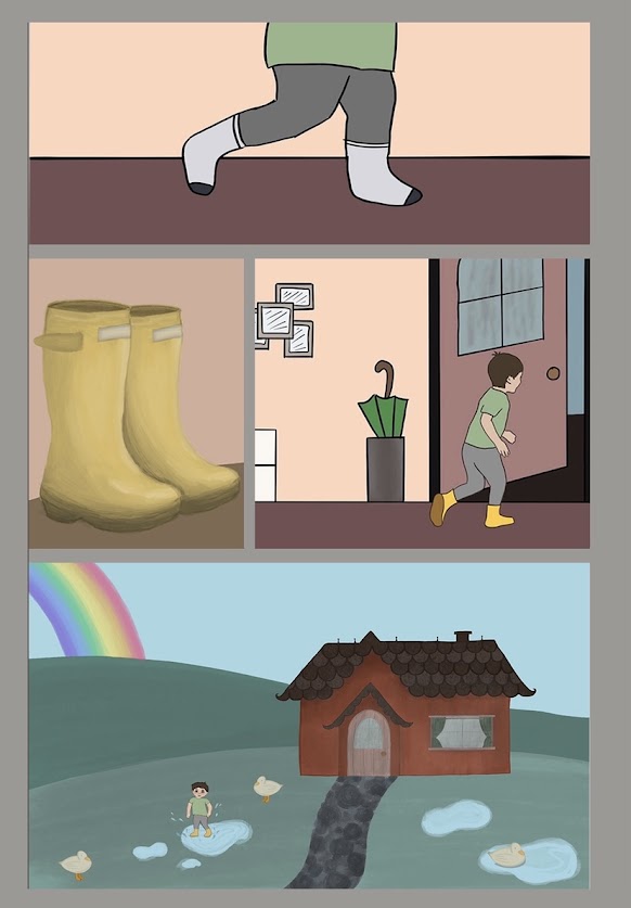
Below are all of the panels I created for the comic, they aren't in order but further below is a link to the final comic.
Below is a quick mockup of what the final comic should roughly look like, I used both mine, and the rest of my groups panels, to make sure there were no panels missing and the comic wasn't disjointed.
Project 2: Technical Skills
Week 1-
|
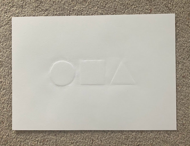
A circle, square, and triangle embossed onto a sheet of A4 cartridge paper, each shape is 45mm high and share a baseline.
The word SHOP cut out of thin grey card and mounted onto A3 paper. SHOP is 80mm high, kerned, and share a baseline. The font used is Rockwell Extra Bold. |
|
|
|
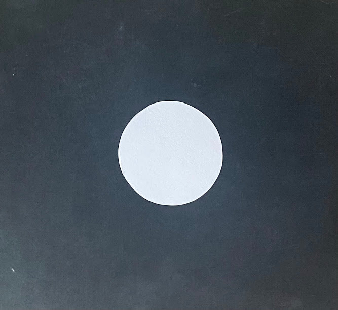
A 40mm radius circle cut out of A4 thin card using a craft knife. The circle was cut out in one continuous movement and has no corners. |
|
An A5 cutting of a pig, on thin paper created using a craft knife. |
|
Week 2-
|
A hollow 3d cube, created out of thin card, each side 70mm long, with no construction marks. |
|
|
|
A hollow 3d pyramid, created using thin card, with no construction marks. The height is 80mm, and width 70mm. |
|
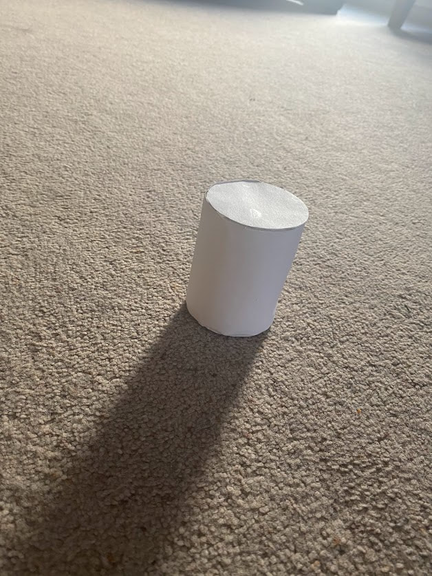
A hollow 3d cylinder, created using thin card, with 80mm height and 60mm diameter. |
|
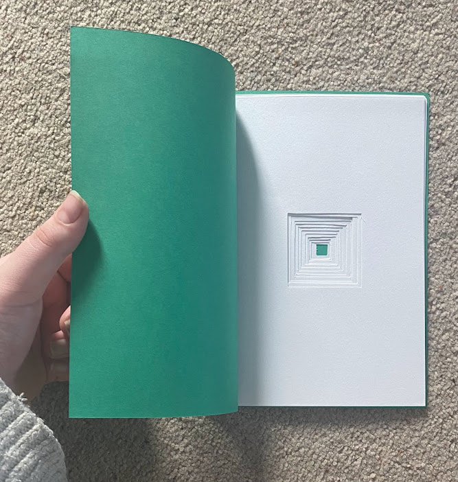
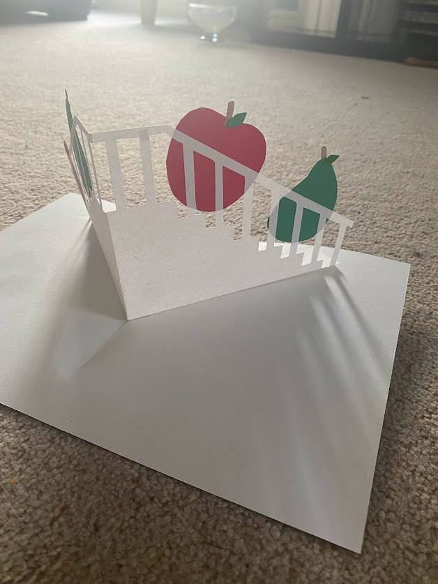
An A4 pop up-book, illustrating the cockney rhyming slang "Apples and pears, up the stairs". The aim was to represent the saying, without using any words or drawings, only coloured paper.
Week 3-
|
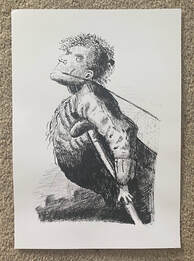
An A4 copy of a piece by Clare
Leighton, created using a sheet of scraperboard. I practiced on a smaller sheet of scraperboard, but struggled to find any tools that effectively removed the dark top layer, so my final piece is very rough and fuzzy in texture. I struggled to get a lot of the proportions correctly whilst working with the negative space of an image |
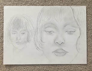
An A4 copy of a piece by Augustus
John, created using tonal pencils
on white cartridge paper. I struggled
to get the proportions of her face
correct on a lot of my practice papers,
and due to not having the right type
of paper (preferably textured) I struggled
to add as much tone, and blend the
pencils as much as I wanted to.
John, created using tonal pencils
on white cartridge paper. I struggled
to get the proportions of her face
correct on a lot of my practice papers,
and due to not having the right type
of paper (preferably textured) I struggled
to add as much tone, and blend the
pencils as much as I wanted to.


