CONCEPTS
Previously I have really struggled when thumbnailing, spending much too long trying to create lots of individual great ideas. Since talking to Tony and Dwayne through out this module, I think it's finally clicked for me and I understand a good thumbnailing process for myself.
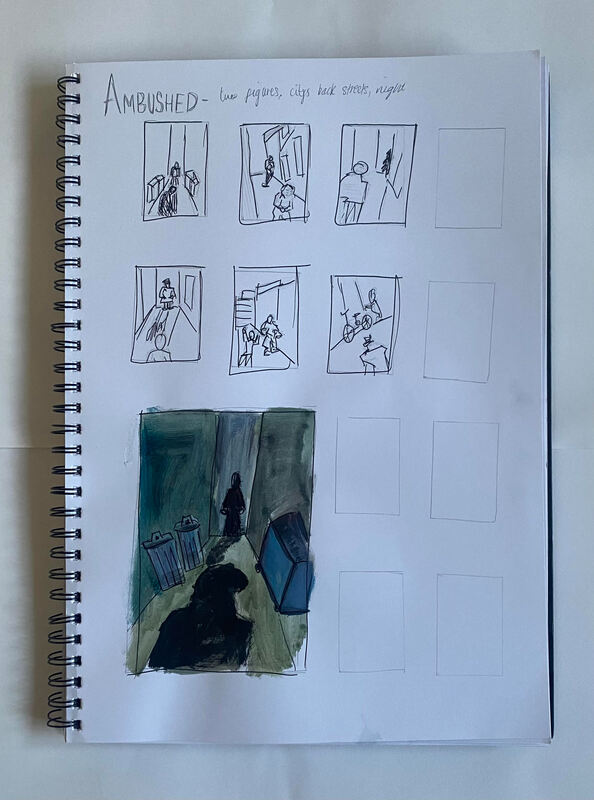
Due to my previous struggles with creating thumbnails, I decided to leave all of my initial thumbnails very rough and loose in shape/style. This meant I got to work sketching out placements and differing layouts, rather than spending 30 minutes sketching out one "perfect" character. Getting rid of this idea that each thumbnail needs to be perfect really helped, I discovered this in my first studio session on this project, when creating super quick thumbnails for the prompt "LUMBERJACK". Whilst none of the thumbnails are anything incredible, the full page took me just over 30 minutes, and allowed me to get my ideas down super quick.
Due to my previous struggles with creating thumbnails, I decided to leave all of my initial thumbnails very rough and loose in shape/style. This meant I got to work sketching out placements and differing layouts, rather than spending 30 minutes sketching out one "perfect" character. Getting rid of this idea that each thumbnail needs to be perfect really helped, I discovered this in my first studio session on this project, when creating super quick thumbnails for the prompt "LUMBERJACK". Whilst none of the thumbnails are anything incredible, the full page took me just over 30 minutes, and allowed me to get my ideas down super quick.
ACTION
Since I tend to get caught up when creating thumbnails, I decided to make all of them very rough and loose, otherwise I would spend hours erasing figures to get proportions perfect, which isn't the point of first basic thumbnail sketches. To fix this, I allowed myself 30 minutes to sketch out the actual thumbnails, then 45 minutes to produce the client visual piece. While this means the client visual isn't as fully finished as I would usually like, it meant that I was more decisive and bold about my design choices. Looking back, I think this helped some pieces, and worsened others. Using such a quick paint job on "A Giant Leap" made the background look mucky and harder to see. This would obviously be changed in the final piece as I would be spending much longer on it, but something to note for future reference when creating client visuals, if I am giving myself such a short time frame to sketch and add colour, acrylic paint may not be the best idea on a small scale.
BODY LANGUAGE
I decided to stick with the same method for the Body Language thumbnails too, as it really did help me to just get stuck in and throw ideas at the page. Halfway through this project Dwayne had mentioned how thumbnails do not have to be lots and lots of different ideas, but only on or two good ones, developed and explored. This was a big help to me as a lot of the time I would be stuck staring at my page trying to come up with 8 separate designs, instead of simply coming up with a few good ones and developing them to a good level. At this point I had already completed almost all of these thumbnails, but used this practice in the next Concepts project.
M. R. JAMES - Oh Whistle And I'll Come To You My Lad
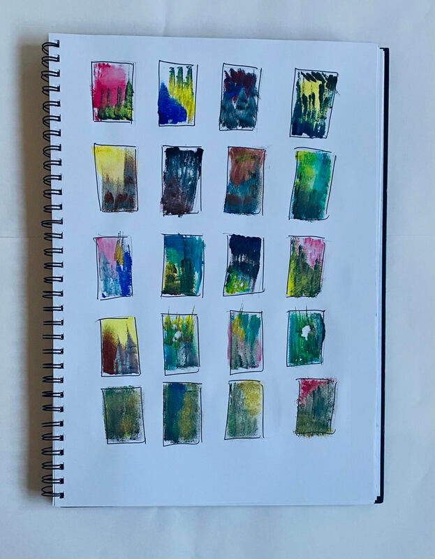
I began this project by looking purely at colour. The text by M R James is a really creepy and eerie story, mentioning figures that seem to be running but making no progress. I knew I wanted the colour palette to reflect this. I experimented using different shades as the highlights, mostly leaning towards yellow and red. In the end I really liked the uneasyness of the yellow lighting paired with darker green shadows.
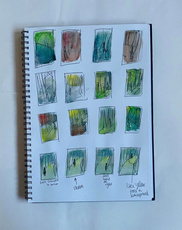
I then went in and added some loose sketches on top of more colour palettes, trying to visualise how a final piece might look. I wanted to lean away from the seaside theme within the text, and look more towards the journey back home from the beach. I thought including trees and being able to experiment with their depths and scale could work nicely and add to an overall creepy feeling from my work.
Before starting on my final piece, I wanted to be certain of where the shadowed figure was going to be placed within the frame. I quickly sketched out some possible placements, and thought he fit best on the left, following the curve of the trees. I knew I wanted him to be moving away from the viewer, having his face obscured adding another sense of mystery to the piece, being unable to know whether the figure is trustworthy or not. I also wanted him facing this way to be moving towards the weird yellow light in the background. I wanted this yellow eerie light to bleed through the trees almost like a mist, and have the figure be on his way to enter it.
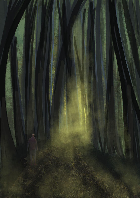
I decided to produce the final piece digitally, using different brushed and opacities to get a sense of depth to the forest scene. I really like the ominous sense you get from the yellow mist creeping forwards. When creating the final piece, I felt the path was too empty and wanted to add a street lantern as another form of lighting the piece. Ideally I would have created some new thumbnails with this aspect incorporated into them, to figure out where was the ideal placement. Instead of this I went straight in and placed the lantern near the figure. I don't think this placement looks awful, but now the left side feels a bit heavier than the rest of the piece. In future I now know to only add extra elements to a final piece after experimenting with thumbnails. I shouldn't be asking myself questions about placements or layouts while creating a final piece, these should all have been figured out during the thumbnailing stage.


