Project 4: Colour, Composition, and Linear Narrative
Week 1- Colour and Composition
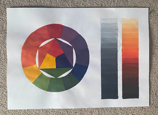
To begin exploring colour theory I created my own colour wheel using only the 3 primary colours; red, yellow, and blue.
Alongside this is two 16 bar gradient hues, one completed using only varying shades of white and black paint, and the other using that same process, but adding the white and black to one of the secondary colours created whilst making my colour wheel.
I found making the gradient hue bars really helpful as it made me realise just how big of a difference a tiny amount of black can make when mixing colours.
Below are six typographic designs, created using only letterforms. The aim of this task was to create specifc impressions without actually using any words, or pictures. The six chosen words were; Scale, Pattern, Masculine, Feminine, Playful, and Power.
Week 2- Composition
|
Anne Yvonne Gilbert:
Anne Yvonne Gilbert is a British artist, whilst primarily illustrating children's books, Gilbert has also designed series of stamps for the Royal Mail. Anne uses textured watercolour paper and high quality pencil crayons, and uses reference photographs of her friends to project onto the boards she uses. |
|
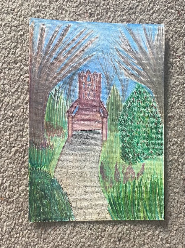
I decided to use Anne's style for the children's book cover, as i thought her work would fit best with this genre. I'm unhappy with how the design turned out, which I think is mostly due to me using the incorrect type of paper, (mine was much to rough and almost canvas-like), and not practicing enough with the pencils. I mostly work in oil paints, so I'm very used to being able to just blend any mistakes away, or paint on top of layers- something that is not as easily done with pencils. I would have loved to add more flowers surrounding the chair, to have the scene feel more like a woodland area, but due to adding the green pencil first, the colours became muddy and weren't vibrant.
|
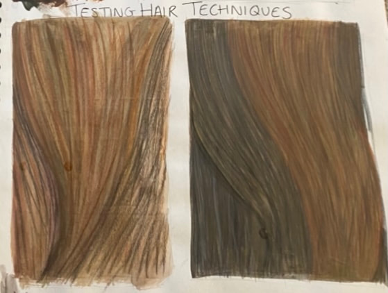
After finishing the Children's cover, I went back and practiced using pencils more as I was frustrated with the outcome. I wanted to try drawing hair so tested different layers, some with watercolour, some with acrylic, and then added the pencils on top once dried. I also tried drawing a rosehip, on plain cartridge paper, but because the paper had no texture I couldn't layer much. Whilst this isn't exactly the technique that Anne uses, I'm much happier with how these samples turned out.
|
|
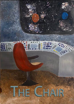
Brad Holland Brad Holland is a self-taught American artist who is well renowned for his illustrations and fine art. Primarily working in thick acrylics, Holland has often spoke about how he incorporates different media, such as pastels, cross hatching in pen and ink, and gritty pastel drawings. For the Sci-Fi genre I chose to use Brad Holland's influence for the book cover. I wanted to incorporate the roughness of his paintings, and used a variety of old, rough, and bristly paintbrushes. I'm quite happy with the texture I managed to achieve on the floor and walls, and think the colour and tone of the chair fits in well with Holland's style. I think the night sky and desk could be improved, whilst they fit the Sci-Fi aspect, I feel they could be done in a style and colour palette similar to Brad Holland's work.
|
Charles Keeping Charles Keeping was an English illustrator, lithographer, and childrens author. Every one of Keeping's illustrations have an eerie atmosphere about them, and many being of a grizzly black and white etching style. Click here to see some of Charles' black and white ink work. Click here to see some of Charles' illustraions for his picture books. When creating my book cover influenced by Charles Keeping, I decided to use one of Keeping's less popular art styles. I felt this could be replicated quite well digitally, and chose to use the Psychological Horror genre. I chose to use darker tones and limit my colour palette as much as possible, to reference Keeping's ink drawing art style.
|
Week 3- Linear Stories
|
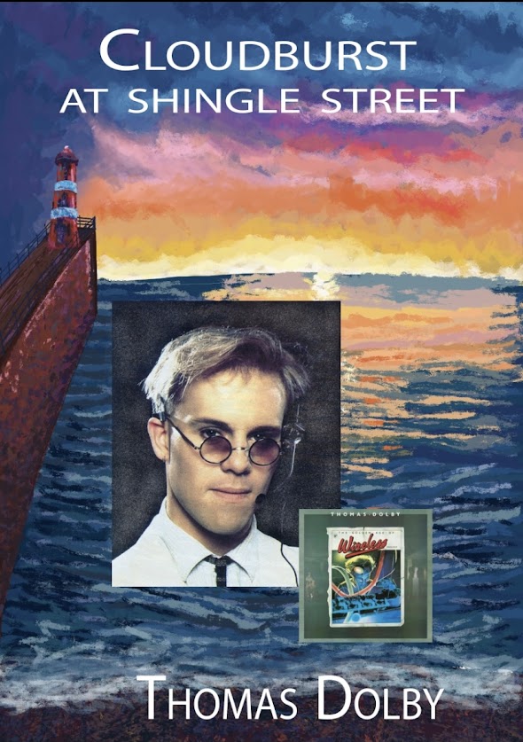
For this project I had to create an 8 page spread on my response as an illustrator to a song. We were shown a list of songs and after listening through all of them and reading their lyrics, I was immediately drawn to Cloudburst at Shingle Street.
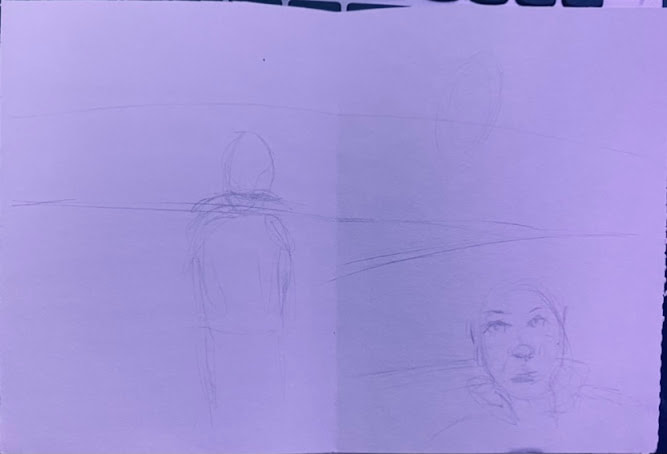
I thought the song was very atmospheric, and during the chorus, when the song begins to build, there's a sense of euphoria which made me think of somebody running to freedom, whatever that may be. I began by sketching out the scenes I wanted to include, trying out different compositions and figuring out a sequence of events to help the book flow. I knew I wanted different angles of the harbour to be shown, but trying to do this without splitting each page into lots of separate panels was difficult. I knew I wanted this project to feel more like a book, rather than a comic, so tried to keep each page as a full picture, instead of lots of small ones. |
|
|
Because we only had a week to finish this project, I knew using reference images would be the quickest and easiest way for me to get my pages complete. Unfortunately, the lighthouse in Whitehaven was closed so I couldn't take any photos myself, so instead I looked at images online, and my own memory of the harbour. To help when sketching in the man, my dad agreed to let me photograph him looking out over the harbour. Whilst I wasn't able to get exact references for me to use, these photos were still really helpful for me to refer to when looking at proportions etc. |
|
Overall, I'm relatively happy with how my spread turned out. I think my understanding of colour was a strength in this project, the shading on the lighthouse, reflections of the sunset onto the water, highlights on the harbour wall. I think it helps give my work that euphoric atmosphere that I felt when first listening to the song.
I definitely think there's places I can improve this book. One part I'm not to keen on is the page with the man "running" down the pebbles to the shore. I wanted to have this effect of him running, but really struggled with how to draw this, even after looking at image references of people running. Whilst I like the effect of the strings of light, I don't think they work as well as they could, considering how stiff and slowly the man seems to be walking. One way I could change this is by making the distance he's running longer. By stretching out the shore, I would have more space for the distance to span over. This would however make the figure a lot smaller in size as everything would be scaled down, so I wouldn't be able to add as much detail.
I think I managed my time a lot better in this project, I didn't faff about with ideas as much as i usually would, and almost immediately got to working. I still think I overcomplicated some of my designs, and had I realised this earlier on I could have altered them, resulting in a better standard of drawing- which I would be happier with.


